Masculinity in the Age of Gucci

New-york-fashion-week.jpgconor-mcgregor.jpgIs fashion-consciousness becoming a marker of traditional masculinity?

My current style obsessions are unlikely characters. Tattooed, buzzcut, and resplendent in their bad attitudes, designer Justin O’Shea and UFC posterboy Conor McGregor are not only the best dressed men at the moment, but the best dressed people, period. They are having an inordinate amount of fun with clothes and have honed in on really interesting personal styles – excruciatingly perfect tailoring with a hint of chavvy toughness that is a delight to behold. Australian O’Shea leans a little more biker and fearlessly incorporates truly insane patterns and ’70s silhouettes into his daily looks, while Irish McGregor is more of a dandy who loves flashy accessories, especially from his beloved Gucci, and uses style as conspicuous consumption tool to communicate his wealth, professional success, and brash confidence.

Typically, the well dressed men of today are urbane, wearing beautifully tailored suits of muted colors — think Johannes Huebl. These men look refined, but their clothing is ultimately utilitarian and not a form of self or creative expression. O’Shea and McGregor on the other hand are peacocking with their clothes – pocket squares! fashion glasses! fur! – in a way we don’t typically see with men. Is theirs an expression of enlightened thinking about masculinity and fashion?

There are no two ways about it – O’Shea and McGregor are tough guys. McGregor beats people up for a living. They are in insane physical condition, tattooed to the hilt, and exude an air that indicates that they are not to be messed with. They are not droll, artistic, Oscar Wilde-type dandies. They are knuckle-cracking, beer swigging dandies. It is unusual, then, for them to be so committed to and downright giddy about their clothes – a quality that is typically imagined as a distinctly feminine grace. How are they both so traditionally masculine, and at the same time, total fashionistas?

I think a significant amount of credit for this ought to be paid to Alessandro Michele of Gucci, who is making menswear fun. Gucci’s quirky luxe fabrics, zany patterns, and quirky appliques, are both playful and tasteful, making it so much more enjoyable for men to get dressed. This fun factor and coolness of the brand might ease any generalized anxieties about appearing too “feminine” by enjoying fashion.

There is a history, too, of tough guys loving clothes. Teddy Boys in the 1950s, Mods of the 1960s, Punks of the 1970s, and rappers through to the present day were all obsessed with the details of their clothes; Mods in particular spent hours doing their hair and tailoring their pants to be as narrow as possible (Colin MacInness documents this well in Absolute Beginners). Communicating a certain cultural stance is paramount in the way these subcultures approached clothes. For MacGregor fashion is certainly part of his larger-than-life persona, but I think both he and O’Shea want to communicate confidence and uniqueness over any sort of cultural or political stance. Their love of fashion very personal: it’s tied to self-expression and completely unmoored from any kind of group “look”.

This injection of self-assurance and individuality into imaginative dressing makes me hope that instead of creating a Guccified subculture, O’Shea and McGregor are instead the beginning of a shift in cultural attitudes towards menswear and men enjoying clothes. Perhaps one day masculinity will be equated with sartorial fun and confidence – and not just clothes as a status symbol, but real enjoyment – instead of a shyness and around spending time and effort on appearance. In the meantime I will be scrolling through these guys’ Instagrams until my I go cross-eyed and imagining what it would be like to date them. And go shopping with them.

Ecce! One million photos.

Report Card: F/W ’17 Ad Campaigns

1201454.jpg
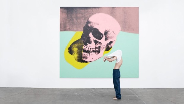
Raf Simons’s first Calvin Klein ad is a perfect mission statement for a new era.

This season’s spate of advertisements is, largely, absolutely fantastic. So fantastic, in fact, I went back and forth about including an exclamation point in this paragraph, but decided not to deploy one for reasons of self respect. The quality label-ambassador pairings we see this season perhaps reflect a deep thoughtfulness about brand identity in a time of industry upheaval—communicating a brand’s meaning is more important than ever when designers are playing musical chairs and consumers are saturated with digital media. Here are some of the high achievers.

Jude Law for Prada

prada-ss17-campaign_2-2-1024x593

I love this. I love this so much that I would wallpaper my apartment with it, regardless of my deeply held opinion that Jude Law is the platonic ideal of human beauty. This minimal shoot by Willy Vanderperre nails the essence of Prada: practical, intellectual, and offbeat. Law lounges contemplatively amongst sand dunes in an array of unfussy and tailored shirts, pants, and even sandals (my rule about men in sandals—that it should never, ever occur unless one is an Olympic swimmer or any other type of water sports professional— is null and void when it comes to Prada, they of ugly-chic splendor). Law, despite actually being the most handsome man in the world, is the perfect choice for Prada, as both actor and brand are at interesting stages of their lives.

Law, now in his mid-40s, is taking a variety of unusual and supporting roles, rather than the typical leading man parts, including in Anna Karenena, The Grand Budapest Hotel, and Genius. At his Times Talk last June, he spoke to this shift as being both more natural than calculated and that collaborating with interesting directors is his main criterion when considering roles. So too, is Prada at a moment of transition. No longer the ‘it’ brand of the moment, Prada is reconnoitering the rapidly-evolving fashion landscape quietly, and perhaps in a reactionary way. Miuccia is carefully observing and pointedly not participating in the conversation around the turbulence of the designer revolving door, see-now-buy-now, and co-ed clothes, which, in a way, is reflective as the label’s status as a true luxury brand — not having to cater or pander to anyone or any trend in particular. She continues to produce quiet, sophisticated, and interesting clothing, almost as if to please herself. She will make large changes to brand strategy when she’s good and ready, but not before a great deal of consideration.

This collaboration is sublime; an alignment of artistic renaissances. and making old favorites current ones.

Grade: A

Charlotte Rampling for Loewe

This is a magnificent pairing — the most unusual and enigmatic actress of the twentieth century posing for Loewe, a recently-revived Spanish luxury label helmed by wunderkind Northern Irish Jonathan Anderson, known for his interesting silhouettes, proportion play, and gender-bending designs. Anderson is himself somewhat inscrutable, and his designs mercurial — some more intellectual, others more commercial — and entirely avoidant of the celebrity PR circuit — one rarely seen his clothes on a red carpet, and when one does, they’re on fellow sublime weirdo Tilda Swinton. Rampling, exceedingly private and dismissive of Hollywood, is the perfect face for the brand; a real meeting of the minds between designer and muse. I only wish this Jamie Hawkesworth-shot series was more visually engaging, and more suggestive of a narrative — a more fleshed-out setting would do the trick. The dark palette, too, makes it easy to visually skip over if one doesn’t have Rampling radar. Perfect casting, unremarkable execution.

Grade: B+

Art for Calvin Klein

1201453.jpg

Raf Simons loves contemporary art. As demonstrated in the excellent yet ungrammatically titled documentary Dior and I, he frequently visits museums and galleries in search of inspiration, and has both collaborated with and referenced the artist Sterling Ruby while at Dior, and in his eponymous menswear line. I was curious to see what the first Calvin Klein ads would look like under Raf — he’s not one for cozying up to celebrities in his personal life or casting them in ads unless contractually obligated, yet Calvin Klein is, historically, a celebrity-driven brand, particularly in its advertising.

Instead of famous people, Simons cannily casts art by Andy Warhol, Richard Prince, and his bff Sterling Ruby in starring roles in the Willy Vandeperre-shot campaign, letting the paintings and their artists take center stage. Still, he plays with Calvin Klein tropes of denim, underwear, and young couples, giving them subtle, modern updates; the result is a little cleaner and a little more European. With the fun and accessible choices of art and the classic branding motifs, Raf acknowledges the label’s pop-cultural roots, but reframes them in a restrained way that is much more ‘him.’ This is a great first ad campaign under the new rule. I am so excited to see what’s to come, and how art will factor in in both the clothing and the advertising. Basically I hope this becomes an empire of Jil Sander.

Grade: A+


State of the Art: When Stella Met Ruscha

Ed_Ruscha_for_Stella_McCartney_Stellacares_fashion_editorial_Harley_Weir_Winter_2016.jpg
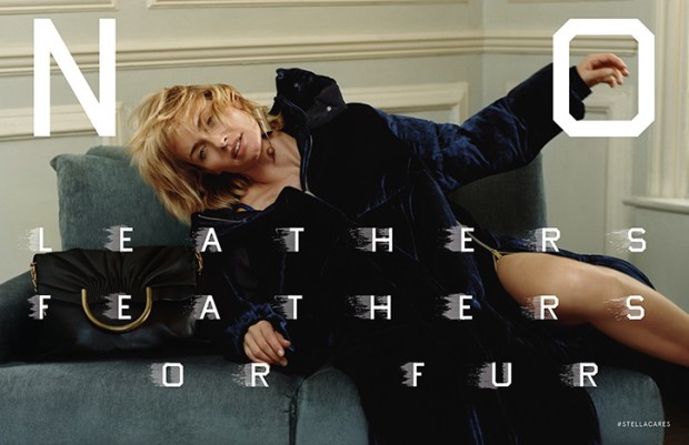
Stella McCartney’s F/W 2016 Campaign

This season, Stella McCartney teamed up with legendary artist Ed Ruscha on her Fall 2016 ad campaign. Shot by Harley Weir and starring Amber Valetta, the ads showcase the label’s core tenant of cruelty-free fashion, with Ruscha’s unmistakable typeface spelling out “No Leather, Feathers, or Fur,” “Veg Out,” and “Meat Free” across the images. This brilliant collaboration sets McCartney apart from her luxury rivals and lower-tier imitators as the undisputed queen of “vegetarian” fashion, and gives her heavyweight artistic credibility, when her famous friends and celebrity clients can sometimes overshadow her importance as a designer and fashion innovator. The campaign is also an unprecedented project between designer and artist that spawns a new chapter in the fashion-as-art debate: can fashion advertisements be art?

The collaboration was born when Ed Ruscha and Stella McCartney appeared together on an episode of Sundance’s Iconoclasts. The two are very different at first glance: Ruscha is a 79-year old Oklahoma-born American Artist whose text-centric art routinely passes through the doors of major auction houses, and is synonymous with a wry west coast cool; while McCartney is a British fashion designer forging a Kering-backed empire of sustainable fashion, and spawn and pal of celebrity. But the two come together seamlessly on the desire to communicate a large, important idea in a pithy and accessible way. Stella has the message, and Ruscha has the medium.

Fashion label-contemporary artist collaborations are nothing new, and the list of ventures is long and varied. Typically, however, we see artist collaborate on the design of a piece of apparel or accessory –  like Takashi Murakami, Richard Prince, and Stephen Sprouse for Louis Vuitton; Sterling Ruby for Raf Simons and Dior; and, most recently, Alex Katz for H&M. This territory is not new for Stella McCartney, who collaborated with Jeff Koons on rabbit pendants in the mid-2000s, which are now going for a pretty penny at auction.

The McCartney-Ruscha partnership, however, as an ad campaign, is a different animal. The closest thing to this kind of collaboration was when David Lynch photographed a campaign for Christian Louboutin in 2008. No other major artist has engaged in the advertising process so explicitly, and so adjacently to his own canon: the McCartney collaboration is an interesting extension of Ruscha’s work as a pop artist, and as an artist concerned with consumer culture, Hollywood, and, in fact, advertising itself.

McCartney’s label was one of the first ‘environmentally friendly’ labels when it was founded in 2001, eschewing the use of leather, fur, and feathers, and promoting organically grown fibers and sustainable fashion. Today, that message tends to be overlooked, and Stella McCartney is seen only as a British luxury label favored by celebrities and Team GB. With sustainability becoming a much-discussed topic and high priority within the fashion community, now is the perfect time for McCartney to remind the fashion world and its consumers of her pioneering status in the field and capitalize on the industry’s priority shift. The best way to remind conscious buyers of the brand’s tenants is visually, which is where the collaboration with Ruscha comes in. Ruscha’s paintings typically feature a word or phrase in a signature blocky font. His deadpan works frequently play on the tension between the opaque and the obvious, and modern life and nature, as many of the words are set against a landscape.

In the McCartney ads, however, the message is nothing but clear and not in the least ironic – Ruscha spells out the line’s ethos and reminds viewers of the label’s status as the only “vegetarian” luxury brand. This explicit visual reminder does wonders for repositioning McCartney as a model for companies seeking to create ethical fashion, and as the crown jewel in the Kering stable in terms of sustainability, which is one of the conglomerate’s biggest corporate goals. It also lends the label gravity and serious artistic credibility, and situates it as unique among labels as a pioneer in the advertisements-as-art field. This is also an interesting opportunity for Ruscha, allowing him to play in the advertising medium for a worthy but ultimately commercial cause, instead of lending tongue-in-cheek critique of consumerism from ultra-expensive paintings.

I’m of the opinion that fashion advertisements are art. They’re a perfect distillation of a brand’s meaning in a few photographs, and thus often more narratively full and than an editorial photograph. The McCartney-Ruscha partnership is the first of its kind, and I imagine an important milestone in positioning advertisements in a more artistic, and less commercial, light. I hope to see more to come – how about Tracy Emin for Gucci?


Bullseye: Victoria Beckham’s On-Point Collaborations

unnamed-2.jpg
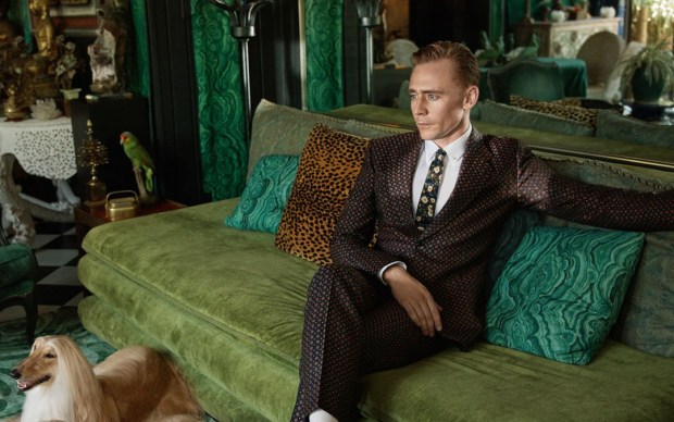
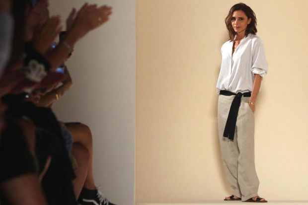
Beckham has chosen two perfect collaborators for her expanding empire.

Last month, Victoria Beckham announced a partnership with Target on a limited-edition capsule collection. Composed of apparel and accessories for women and children, the collection will debut in April 2017, and is a brilliant move on behalf of Ms. Beckham, who also has a newly-minted cosmetics deal with Estée Lauder. These selective, on-brand collaborations will set Beckham up for long-term success, and simultaneously lend the ventures more credibility than if she were to launch additional sub-labels under her own brand – if she’s able to keep them both accessible to an entry-level buyer.


The Beckham-Target union is fantastic for both entities. It’s such a good fit for both brands, and it’s certainly the most exciting PR either party has received lately. Beckham has been struggling with her eponymous business in the last couple of years, due to a lack of standout pieces and a general consumer unwillingness to pay ultra-high prices, and needs a new product and price point without diluting her label. Enter Target.


Target, the upscale yet ultra-accessible American retailer, is the perfect place for Beckham to launch her latest venture. They have a history of successful high-fashion design collaborations – Proenza Schouler (2007), Rodarte (2009, from which I still wear a dress), Missoni (2011, which famously crashed their site), Jason Wu (2012), Phillip Lim (2013), Peter Pilotto (2014), and Altazurra (2014) – and have a great formula for creating an absolutely vicious feeding frenzy around the limited-edition capsule collections.

Target’s latest designer collaborations, with Lily Pulitzer (2015) and Marimekko (2016), especially, were met with a collective huh? and sluggish sales – honestly, who thought Lily Pulitzer was a good idea? – but Beckham’s line, which will be composed of apparel and accessories for women and children, will be explosive both because of the content and its famous designer.


Beckham is aspirational – wife, mother, multi-hyphenate career woman, cultural icon– and makes clothes that both fashion and non-fashion women alike will want to wear: flattering, simply-cut dresses, pencil skirts, structured bags, and classic, oversized sunglasses. She is also a hands-on mum to four very cute kids with her handsome, superstar husband, making her an ideal candidate to design functional yet stylish childrenswear (anyone who birthed Romeo, my much-documented favorite child in all of Hollywood, and the very cute and precocious Harper, I trust completely with all aspects of child rearing.)


Partnering with Target for a lower-priced line, and especially for childrenswear, is a better course of action than trying to incorporate them into her label, which already has a lower (ha) price sub-label, Victoria Victoria Beckham. They will be much more accessible to American shoppers that way, and won’t be siloed only among the fashion crowd, in the way that Stella McCartney’s childrenswear is. And an in-house sub-label at fast-fashion prices would hurt her overall brand if not distributed in collaboration with a reputable yet accessible third party like Target.


So good and accessible in fact, is Beckham’s simple, fashion-forward aesthetic and so aspirational is her lifestyle to women, especially mothers, that I think the she could be hugely successful in a long-term partnership with Target, à la Isaac Mizrahi. She is more suited to this kind of partnership than any other Target collaborator because of her mainstream celebrity, unlike Pilotto or Altazurra, who would only be recognizable to the fashion set. I wouldn’t imagine that this kind of high-low partnership with would threaten to dilute Beckham’s high-end line because of the difference in price and quality – women buying thousand-pound Victoria Beckham pieces aren’t going to stop buying those pieces because plebs can now get items by the same designer in Target; the two ventures are very different animals for two very different audiences.


Beckham’s partnership with Estée Lauder is also a mutually beneficial endeavor. As the most established cosmetics brand, working with Estée Lauder automatically legitimizes the quality of Beckham’s product, a range of pretty pinks, soft browns, and classic reds for eyes, lips, and cheeks, which can be bought individually, or in London, Paris, and New York-themed kits – a marketing venture to which I am extremely susceptible. The Beckham factor brings some contemporary glamour and pop cultural relevance to Estée Lauder, which, while being the gold standard for good quality cosmetics, can read a bit old-fashioned, especially to the younger set who prefer the likes of slick Milk Makeup and other cult-y labels.


The price point on VB x Estée Lauder, however, is shockingly high – I imagined it would be in the YSL-Dior-Dolce & Gabbana price arena, but it’s closer to altitudinous Tom Ford level. The offerings are pretty and wearable, but not, I think, worth $95 for an eyeshadow palette. The prices won’t be a deterrent for women already splashing out on Beckham’s high-end clothing, but for most women, and young women especially, whose entry point to a luxury brand begins in cosmetics, it’s too dear. While this Estée partnership is brilliant in theory, I think the execution was too ambitions, and not inclusive enough for the millennial and young Gen-X audience.


Victoria Beckham is on the perfect track to expand her empire through partnerships with esteemed, established brands that will allow her to capitalize on her celebrity and aspirational lifestyle and validate her ventures into new categories. I can see both collaborations extending into the long-term, if she re-thinks the pricing structure for VB x Estée Lauder. As it stands, it’s a little too Posh for a sizeable and lucrative section of her audience.

State of the Art: Burberry’s Post-Brexit Guild-ed Age

burberry-fw16
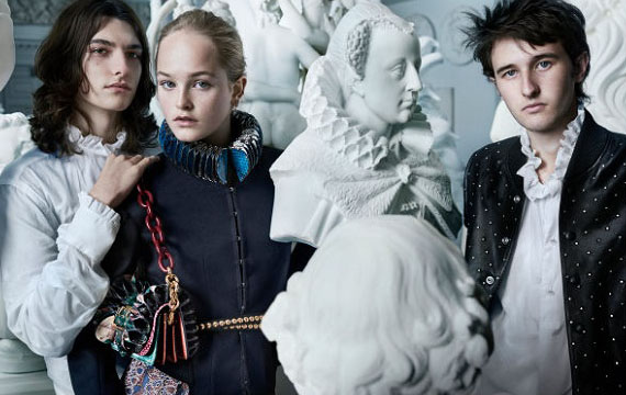
Is Burberry making a conservative political statement with its latest campaign?

Fall collections (spring collections? What are we calling them now? In any case: clothes shown in September) are always a bit more academic than their spring counterparts. Labels love to embrace the the back-to-school conceit: warm layers, crisp fall days of paging through course descriptions, and cozy autumn nights spent pouring over books in a university library in front of a roaring fire with the brilliant but troubled heir to England’s most storied dukedom.

Oh, just me?

Anyway, this year’s back-to-school fashion has pulled at interesting art-historical and art-philosophical threads, spawning interesting conversations about fashion as art, art in advertising, and artistic quotations — or appropriations — in apparel. This will be the first post in a three-part series unpacking these conversations, and what they mean for luxury strategy in a time of great industry upheaval. Take notes!

Burberry & The Makers

burberry-fall-2016-ad-campaign-the-impression-02

No, not a tribute band to the criminally underrated Reverend and the Makers, but the overarching theme of Burberry’s Fall 2016 strategy.

Following the Romantic, ruff-tastic September runway show, the label put on a pop-up exhibition in London called Maker’s House, where visitors could explore activities corresponding to crafts involved in the process of creating a Burberry garment or accessory, such as embroidery, engraving, and metalworking; or chat with a Burberry archivist about the brand’s history of craftsmanship (archivists: CALL ME). Guests could also interact with other artistic activities either tangentially connected with or theoretically adjacent to fashion, including drama, bookbinding, portrait painting, screenprinting, and calligraphy. I separate the categories here, but they were all presented side-by-side in a holistic way, treating all of the arts categories as relevant to the fashion-making process, but with a heavy emphasis on “making,” particularly of a physical product with one’s hands.

The subsequent ad campaign, a huge step up from last season’s tween-ish, Snappchatty-misstep, similarly reflects the process of creating heritage fashion, featuring either a sketch of the accessory or outfit, or an image of a craftsman opposite the finished product.

Burberry’s Maker’s House, while feeling a little too earnest for my taste and too ready to deploy my least favorite word, artisan, is both a safe yet unadventurous strategy for a post-Brexit Burberry, and an interesting plot point on the fashion-as-art chart.

Maker’s House exhibition explicitly situates fashion, specifically its technical side, squarely within the fine arts spectrum, almost like a guild-ish, specialty trade very specific to Britain. This is a great way to sell products to a discerning audience that values craftsmanship, but of all the rich and romantic cultural and historical connotations of Britishness, craftsmanship is not an especially glamorous tack to take. In fact, it’s the kind of traditionalism embodied by the Leave vote.

Now, I wouldn’t be so indelicate as to implicate anyone in the fashion community as being anything but the most ardent Remainers, but strategically, Maker’s House, despite its celebrity visitors and fun PR opportunity, is a very conservative concept. With this exhibition, Burberry has aligned its luxury fashion production with humble tradesmen, celebrating tradition, individualism, and manus over machina as their definition of Britishness post-Brexit. I would have expected a more cosmopolitan response from Christopher Bailey, something like a YBA collaboration, a campaign starring Zadie Smith and Zayn instead of Edie Campbell, AGAIN, or a zeitgeist-y celebration of Cool Brittania, with the Moss, Gallagher, Beckham, and Law kids as a response to what Britishness means now, and not, as one reader has put it, a return to the Shire. I think Maker’s House should have been more of a celebration of fashion as a visual, experiential, and performative art, and slotted fashion alongside the more analogous (and glamorous) British traditions of music, painting, literature, and drama, rather than a manual craft. But then again, this might be a London or England-centric point of view. However, I think it’s essential for Burberry to keep its cool edge, and not fall into a Mulberry slump, or worse, become a leather-goods-only bore or a suburban joke. Coach, I’m looking at you. Don’t you. Even. Think. About. It.

The weak pound might actually give Burberry some room to play and embrace a more cosmopolitan narrative of Britishness in upcoming seasons. Although their shares are down and the luxury market is having a difficult year, Burberry has been doing relatively well in the home market, thanks to tourists flocking in to shop. Not well enough to counteract the overall luxury slump, since 85% of their sales are made outside of Britain, but much better than expected.

A double down on their uniquely British identity post-Brexit was exactly the right tactic for Burberry to take in this first season after the political shake-up, but they chose the wrong strand of British creative arts to celebrate and with which to associate the brand – the technical crafts rather than the visual arts. With all the romantic, rich cultural and historical cache from which to draw surrounding what it means to be British today, Burberry played it too safe in placing their craftsmanship heritage above a more interesting and consumer-friendly facets of the brand, like their long investigation of British rock & roll, celebrity ambassador opportunities, and, simply, really interesting, fashion-forward pieces that could make a killing if they hit Instagram Gucci-style.

I’m hoping Burberry changes direction for their always-great holiday campaign, where they can really have fun and hit heavy with star power. All I am saying is that it BETTER star Millie Bobby Brown, Tracy Emin, and Harry Styles or I’m going to have to up my dosage of antidepressants.


Celebrity Image Rehab with Alessandro Michele

tom2.jpg

Tom Hiddleston is covering major ground on the road to an image makeover after a humiliating summer.

Well, well, well, look who it is showing his sheepish and handsome face in the fall Gucci ads.

None other than Mr. Thomas William Hiddleston, actor, Shakespearean, and international punchline on a level of schadenfreude never before witnessed by human eyes.

After a summer of being a gossip site punching bag, human Muppet, and court jester to Satan, and along with losing the Emmy for The Night Manager and any shred of hope of landing the role of 007, Tommy is in need of a serious image overhaul. And what better than posing for the hottest luxury label in the world to regain one’s shredded dignity?

Tommy is a good fit for Gucci because of the new aesthetic direction Alessandro Michele has taken with the brand in the last year and a half. Gucci now codes for quirky, oddball glamour, with its Wes Anderson color palettes, zany accessories, and an overall aesthetic of weirdo chic. Tom is both classically handsome and very normal whilst being a pale, weirdo icon because of his roles in Marvel films and cult-y flicks like Only Lovers Left Alive. It has been sneeringly (and accurately) speculated that Tom wanted to shed his comic-con fanbase and become more of a mainstream movie star, presumably using a high-profile “relationship” with a singer as a spingboard (said singer who is “as big of a danger to the world as ISIS,” as my mother has put it.) But fronting a quirky brand like Gucci, instead of something like an ultra-boring but alpha male suit brand, is a gesture of atonement to disgruntled Dragonflies – I’m still in here, says Tommy. Forgive my desperation and moment of true, fever-dream, out-of-my-mind, insanity. Remember how good I was in Deep Blue Sea?

Tom’s also good for Gucci because of the label’s quest to embody the spirit of bohemian, English eccentricity. Michele, having worked for Gucci in London when under Tom Ford, is my peer in Anglomania, and has implemented a number of initiatives to imbue the Italian label with a British sensibility over the past few seasons, including holding a show at Westminster Abbey, forging a long-term partnership with Chatsworth House, where the Cruise 2017 campaign was shot, and appointing scions of offbeat, British glamour to be brand ambassadors, including Alexa Chung, Florence Welch, and, in a stroke of genius so sublime it makes me want to cry, Vanessa Redgrave. Tom’s a good celebrity to add to this stable, because he’s so very English – he literally looks like he could be an English gentleman from any of the last ten centuries – and yet current, handsome, and a little bit quirky.

This partnership happens to occur precisely when said gentleman is in need of some good press. No other brand is on Gucci’s level in terms of Instagram-mania, excitement, critical acclaim, and just really really cool clothes – exactly the kind of associations Tom needs after his summer of PR thirst exploded in his face over and over again like trick birthday candle. I’m convinced that Gucci is the only label that could rehab Tommy’s image in the public eye just at this moment, and I grudgingly admit that I feel relieved that Michele extended his hand to Tom in a gesture that marks Tom as pathetic no more, but actually cooler, and certainly more fashion-forward, than he was before his bummer summer.

The ads are great, too – saturated confections of satin and velvet dandyism, complete with  Judith Light dogs and feelings of isolation and anxiety that’s all both beautiful and slightly repulsive to look at. I applaud the execution and I think Tom bring something patrician yet geeky to the mix that makes him pitch-perfect embodiment of the Gucci look today.

I think young Tom has a ways to go on his path to media redemption and restoration to the title of the Thinking Woman’s Internet Boyfriend, but I can’t think of a better way to start than by starring in an ad like this for a brand like Gucci. Alessandro Michele might also want to consider a second career in celebrity image rehab. Move over Dr. Drew.


The Dos and Don’ts of Branding with a Deceased Celebrity

Natasha-Gregson.jpg

The recently-launched Natalie Wood fragrance


Celebrity fragrances are an incredibly weird concept in the first place. Of all the things for a famous person to sell to fans, why  a fragrance? Everyone can wear a t-shirt or use accessories like a phone case or a wristband, but scent preferences are extremely personal – not everyone is going to like the scent you’re shilling.

I suppose it’s a more upmarket, “sophisticated” product, and even intimate way for plebs, especially young ones, to connect to their favorite celebrity. I get it for pop stars like Lady Gaga, Katy Perry, Satan, and One Direction*, who have very specific personal brands and hoards of young followers who want a piece of their favorite singer (*might I request a 1D fragrance this upcoming holiday season?). But why do B-ish list actresses like Jennifer Aniston and Hallie Berry have fragrances? My research even confirms that Bruce Willis has a fragrance. These actors probably have a handful of super fans, but besides those weirdos, who buys these fragrances? It is so comically weird and superbly absurd it truly puts me at a loss for words.

So imagine my out of body disbelief when I discovered this week that Natalie Wood’s daughter is launching a fragrance inspired by the late actress.

Sure, I like Natalie Wood as a consumer of mid-century Hollywood glamour and as someone unhealthily interested in true crime. I don’t however, think of her as a beauty or cosmetics icon, but maybe could be persuaded to make that leap with a strategically-marketed product. But that’s not the case with her fragrance, and there’s a larger problem at hand: she’s, well, dead, and under suspicious circumstances. I don’t want something as intimate and personal as a perfume to be a blend of a watery grave with hints of Christopher Walken, and framed by some rich top notes of Du Maurier. And it’s not as if Wood lovingly created the fragrance herself whilst alive – it’s simply “inspired” by her favorite fragrance with her name and image licensed to it. It’s supposed to be glamorous and slightly maudlin and the next White Diamonds, but I just find it creepy and inauthentic. Let’s take it a step further: would you buy a Sharon Tate brand fragrance? I didn’t think so – the negative connotations are too strong.

Now, if Luca Dotti licensed his mother, Audrey Hepburn’s, image to a fragrance, it would be less odd because Hepburn was more of a mainstream celebrity upon whom so much aspirational projection is made, and whose death was only the most minor footnote to her legacy. It would still seem a little garish and profit-driven, but not cloaked in the macabre. Dotti, smartly, has released a cookbook of Hepburn’s favorite recipes and a photography book of rare photos of his mother during the years she lived in Rome, both of which, incidentally, are on my Amazon wish list. This is the way to honor a deceased celebrity parent – it is tasteful, personal, and restrained. Wagner girls, take note.

But there are other ways to successfully market a deceased celebrity – even one who met an untimely end – without any elements of eeriness.

MAC is launching a highly-anticipated limited edition Selena Quintanilla cosmetics line in October 2016, in collaboration with the late singer’s sister. Superstar Texan-born singer Quintanilla, as you will know, was murdered in 1995, but remains one of the foremost Latin music and beauty icons. People are going berserk over this cosmetics line and desperately trying to preorder any pieces they can, presaging what is sure to be a sell-out debut.

The Selena range, which is tightly comprised of three lipsticks, a handful of eye shadows, a liner, a mascara, and a blush-bronzer duo, isn’t weird at all. It’s an exciting, well-deserved mainstream celebration of her legacy. This is because of the authoritative partnership with MAC and the exclusive feel of the limited-edition run. Having an established beauty brand back a celebrity product gives the entire venture a feeling of expertise and legitimacy – it’s not just a famous name flapping in the breeze by itself. The presentation of the products also helps banish any feeling of creepiness. No soft-edged black and white photos here – the range is photographed and packaged in glorious technicolor with a slick logo and bright purple casings. It’s fun, youthful, and celebratory in a way that only makes a consumer think of the singer’s life and art, and not her tragic demise.

If the Natalie Wood perfume had been presented as a special collaboration with a cosmetics brand like Estée Lauder, it would loose all connotations of creepiness, and instead take on a must-have, glamorous quality (and likely be resold for three digit figures on Ebay.) The importance of a legitimating partnership with a global beauty brand is absolutely paramount to the success of such a product, and scarcity the best way to create a fan frenzy. Perhaps the Misses Aniston and Berry should note this in the event they try to launch follow-up fragrances. Mr. Willis, however, might want to just cease and desist.

Now that we know the rules, here are a few dream collaborations:
— Nars x Marlene Dietrich
— Nars x David Bowie
— Nars x Hitchcock Heroines
— Anistasia x Vivien Liegh
— Estée Lauder x Princess Diana
— Estée Lauder x Grace Kelly

Can Ubiquity Make a Brand Invisible?

michael-phelps-rio-olympics-gold-medal-1.jpg
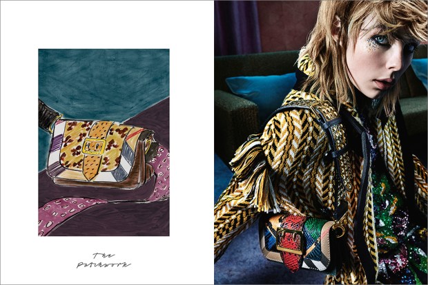
Do we even see the Nike logo anymore?


The USA Men’s Olympic Swim Team faced not one, but two scandales last week — the lesser-known and more interesting of which is that Michael Phelps, the superstar of Under Armor’s stable of representatives wore sweatpants featuring a very prominent swoosh on the cover of this month’s Sports Illustrated.

But did he even realize he was wearing it?

All members of Team USA are required to wear Nike gear when competing in the Olympics per the USOC, even if it conflicts with an athlete’s personal sponsorship. This is a tricky branding situation for which I can’t think of another analogy — if a celebrity represents a designer label, she usually wears that label to events, but not necessarily in everyday life or in magazine editorials. This spawns its own interesting question: is an athlete obligated to wear his sponsor’s gear in an editorial, if other celebrities are not held to the same standard?

My answer to that question would be no, but in any case, Phelps is decidedly not in Olympic uniform in this photo. His clothes could be his own or chosen for him (unlikely; no self-respecting stylist would put him in that Zuck-ish polo), but regardless, did none of the individuals involved in this photoshoot —the athletes, stylists, photographer, editors, et all — even notice that he was donning a Nike swoosh? I think it was completely invisible to them, even to Phelps himself. This should be a smug moment of triumph for Nike, besting Under Armor, but instead it’s an indication of an issue in Nike’s brand recognition.

Nike is such a behemoth that it’s a synecdoche for all atheleticwear, in the vein of Spandex, Xerox, Kleenex, and, in Texas, Coke, standing in for all of their respective related or competitor’s products. It’s so big, in fact, that our brains barely process the logo anymore, like speed-reading through something you already know. I wouldn’t have even noticed that Phelps was wearing Nike pants in the photo had the fashion industry not started buzzing about it. But is that a good thing or a bad thing for Nike?

I think it’s both. It’s great to be the synecdoche because it’s a guarantee of popularity and quality. But a brand can become too big and lose its meaning  unless it’s kept ultra-current, which Nike is good at doing by offering enormous variety and customization options. But still, the logo can go mentally unprocessed. Who are Nike’s spokespeople? I can’t name a single one besides Michael Jordan in ye olden days. Perhaps more visible advertisement, beyond a small smooth Swoosh on an athlete’s lapel, would lend the brand more concrete meaning to an audience that doesn’t obsessively consume sports. Perhaps they should also consider non-athlete or famous spokespeople to front or even design for the brand, like what Puma has done with Rihanna, or non-traditional athletes, like Misty Copeland for Under Armor. I would love for a celebrity trainer like Mary Helen Bowers to be a spokesperson for Nike, or for Nike to do a black-and-white photoshoot starring an icon like Mikhail Baryshnikov (who, does, I can ah, say from personal experience, wear sneakers in his downtime.)

My next instinct would be to advise Nike to carve out niches within its bigness, like going after the fashion set. Adidas already has the upper hand here, however, with its ultra-popular Stan Smith and its collaborations with Kanye West, Raf Simons, and Stella McCartney. Reebok, too, is collaborating with interesting non-apparel labels like FACE Stockholm to appeal to a young, trendy set.  Nike could continue to expand its fashion collaboration attempts, like the one launched with Ricardo Tischi earlier this year. Carine Roitfeld for Nike has a nice ring to it.

In the short term, to boost its falling stock, Nike could push the Huarache shoe into becoming the next Instagram star, like the white-and-burgundy Nike Free was few years ago. This style is on the precipice of really “happening,” and just needs some more Instagram and editorial coverage.

Nike can combat its logo invisibility with a revamped advertising platform, since it’s not the logo itself, but its ubiquity coupled with a lack of meaningful advertising that causes the brain skip. But really, we don’t have to worry about Nike going anywhere despite interesting and innovative endeavors by its competitors. It already has the cultural resonance (and money) for permanent staying power, as long as it doesn’t get too comfortable on its laurels.